home link info link portfolio link stuff link
  MUSIC  INDUSTRY    : :    CORPORATE  BRANDING  &  DESIGN     : :     OTHER  MARKETING  WORK


CORPORATE BRANDING & DESIGN


Branding: Logos & Corporate Identity


TRANSLUCENCE Biosystems
 
ACTIVITY SIGNALING


The visual components making up the stylized 't' of this logo represent 2 central aspects inherent to advanced research techniques developed by this biotech company. Through
special procedures, biological tissues can be prespared in such a way as to become clear
thus allowing for specific antibody fluroresence to be observed throughout the tissue.
So as we view the logo from left to right, we see the simultaneous lightening of the blue segments, representing the tissue, along with the intensifying of the green elements
which symbolizes the increasing visibility of the
tissue staining thanks to the clearing.

 
The focus of this biotech company involves the
ability to detech gene expression that is solely
based on neuronal electrical activity. Therefore
the focus of this logo is the central 'A' in this
case taking the form of an action potential which
is the basis of neuronal communication and
synpatic impulse propagation.


ENOG Inc.
 
EQUINOXE LifeCare
 
 
The key design directive for this task was to create
a unified clean and simple graphic which integrated
the concepts of both decanting wine with the
process of allowing the spark of an idea to breath,
grow and develop into a full and rich concept.
 
The sybolism is of course straighforward here in the representation of the equal halves
of the equinox. But also, the sun/flower image is meant to also convey 2 life related
qualities in line with the healthcare nature of this company. The flower is meant to
express a sense growth while the sun is intended to reflect the life-giving aspect of
the company.


The MORE Group
 
INTEGRATA  architecture & construction
  
 
The general idea here was to evoke both the
diversity of the company's offerings along
with a sense of order, support and stability.
 
For this branding project, one of the main ideas that the client wanted to convey
symbolically through the logo was to somehow show how the 2 facets that made
up the company, the architectural design half as well as the construction half worked
equally together to represent the company's identity. Therefore what I ended up with
was that I combined the lowercase a and c into a unified balanced form which then
worked tegether to evenly surround the central i representing the company's core.
• • • ANiMATED VERSION • • •


REVIVE RX Skin Care
 
 
As a rejuvinating skin care product, the intention was to express a couple of different main elements. The first was to symbolically integrate a sense of 'turning back the clock' with this product. The next was to present a naturally healthy and 'organic' product angle, hence the leaf as the arrowhead of time's backward sweep as well as the use of a lighter green of fresh younger leaves. The design also incorporates an implied though subtle forward motion as if the top round part of the R is ready to roll forward, meant to elicit a sense that the product is ready to move and start the process. At least that's the phsychology behind the developement of the logo.


McGill University


ArchéoScience-ArchéoSociale
Groupe de recherche établi au
Département d'anthropologie
l'Université de Montréal

 
Woods Hole Public Library
Woods Hole, MA

IN-LIBRARY MUSIC CONCERT SERIES


Other Previous Clients & Types of Projects:


CORPORATE / GOVERNMENT


Law Offices of Kenyon & Kenyon
[New York City, NY / USA]
Diagrams and redrafts for corporate patents

OceanWide

(Marine shipping e-commerce company)
Marketing material

IatroQuest Corporation
Anagenis Inc.

Chronogen Inc.
(Biotech Companies)
Branding and marketing material

Royal European Investments
Website & content / photography

YMCA 
Marketing material

Centerstone Ventures
Venture Capital Firm
Corporate branding

Pierre Belvedere, Inc.
[Montreal, Canada] 
Product display layout design
Catalog-related material

Youth Employment Service
[Montreal, Canada] 
Marketing materials

Government of Canada 
• Website content

Canadian Coast Guard
 • Diagrams for technical reports

Province of Quebec
Department of Justice
Illustrations for court case presentation


COMMERCIAL / RETAIL


Just For Laughs Festival

[Montreal, Canada]

On-stage presentation material:
George Lopez Gala (2007/07/20)
William Shatner Gala (2007/07/21)

Planet Hollywood
Special event promotion

Finlandia Vodka
Montreal Grand Prix ad campaign promotion

Kaizen Restaurant
Tokyo Bar
GoGo Lounge

[Montreal, Canada)
General event promotions

Johnnie Fox's Pub
[Dublin / Ireland]
Saint Patrick's Day promotions

Fleming Artist Management
Concert event promotional meterial

J.S.E.M.
(marketing/branding agency)
Marketing campagin material

ProDrive Systems
Technical schematic illustrations
Training brochure layout

Keptinsight Productions
Film & multimedia productions
[Berlin / Germany]
 
Movie press kit, posters, previous web site
Art show invitations, posters, web & print ads

Ravensburger
(Educational toy company)
Children's Puzzle Map of Canada

ACADEMIC / EDUCATIONAL


Marine Biological Laboratory

[Woods Hole, Massachusetts / USA]
Design & coding of interactive map web page

Canadian Federation of
Biological Sciences
45th Annual Conference
[ Organizing Committee member ]

Design of all conference print material including:
•Poster, brochure, ads, meeting kit, o-site signage

Canadian Fertility & Andrology Society
•Marketing material

McGill University
[Montreal, Canada]

 
Dean of Students / First-Year Office
  • Discover McGill (Orientation Program)
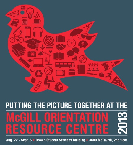
McGill Orientation Resource Centre
  • Annual campaign (1995-2011)

Department of Physiology
Department of Pharmacology
Faculty of Medicine

Center for Non-Linear Dynamics
Center for Biorecognition & Biosensors

Center for Gene Regulation
Electron Microscopy Research Facility
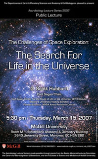
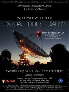
Astrobiology Lecture Series

  •2004-2012 posters & newspaper ads
 

Also: Figures & illustrations for numerous scientific journal articles